From the Newsletter
AI Can One Shot It. I Can't.
The first attempt gets me surprisingly far. Then I start figuring out what I actually want.

If you're trying to get comfortable using AI, X and LinkedIn offer plenty of examples of somebody making something amazing in one shot. And yeah, the first shot can be pretty amazing.
I rarely stop there. I'm more like ten versions, based on what I'd like it to do once I see what it has done.
This animated explainer about my writing took nine versions. I used Claude Opus 5.5 on High effort, and I kept changing what I wanted the video to be about. Here's the finished video.
To make something like this, I would have needed an artist, a composer, a narrator, a writer and probably someone to work out the storyboard. Opus wrote and ran the code on my Mac mini, wrote the narration script and composed the music. Google's Gemini speech model supplied the voice.
That's still kind of insane.
Here's how I do it. I start with an outline of a deck or some research I've done, and I give it a theme. Then I just speak the entire thing. Let's say it runs ten or fifteen minutes.
I'm basically giving the presentation to myself. I record it either with Apple Notes, which offers free transcription, or with a tool called Monologue, which I really like.
Once I have that, I take the transcript and the slides and give them to Opus 5.5 on High. I tell it to render a fully animated explanation that stops and pauses with the slide clicks, and to make sure those clicks will work with a clicker on stage.
It pretty much can do it.
That's not to say what you saw above didn't take hours of refinement. But it still would have taken literally dozens of additional hours to try to recreate those animations and that movement myself.
I can get something like 90% of the way there on the first shot. Then I have something to react to, and my requests start getting more specific.
The first storyboard mapped roughly 18 months of my writing. It showed the themes growing and connecting. I thought it was really good.
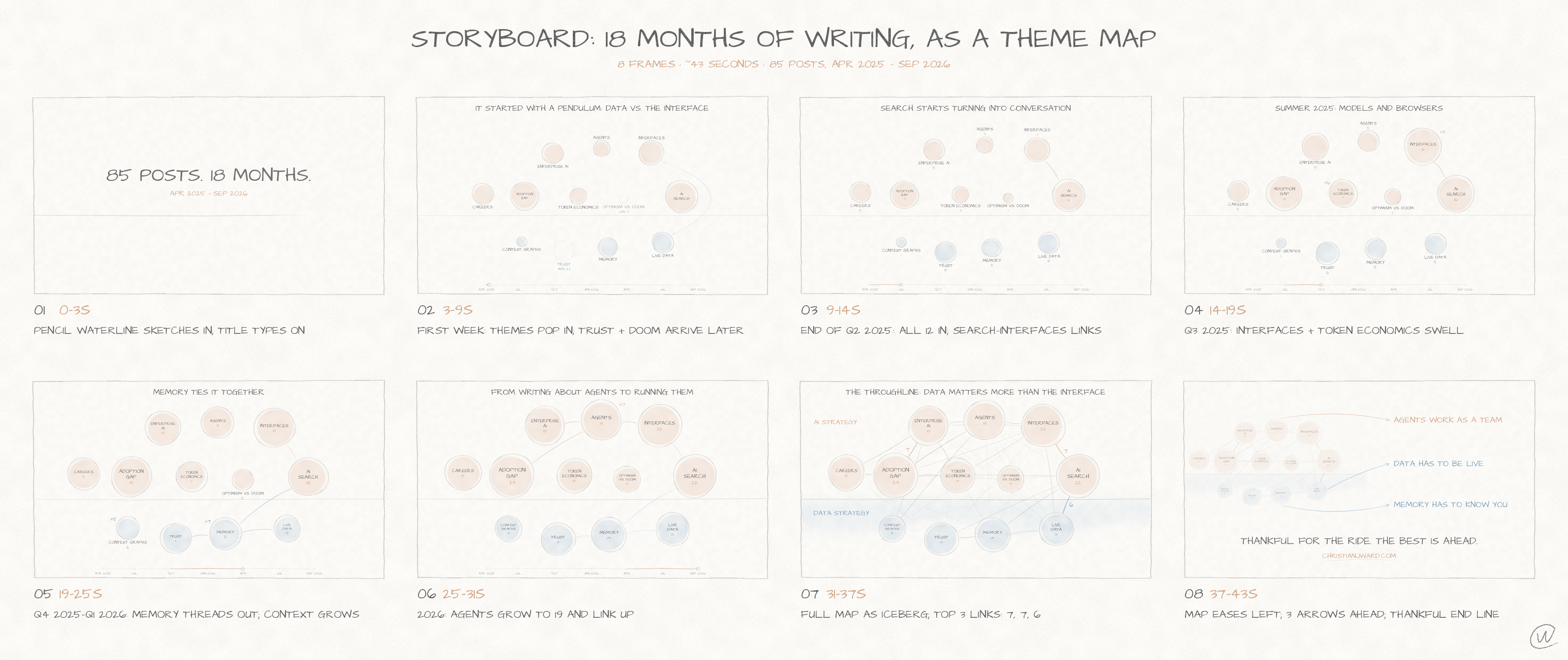
The pencil lines were too light, though. I wanted darker marks and the iceberg on screen from the beginning, with AI strategy above the waterline and data strategy underneath. The next storyboard built the video around that.
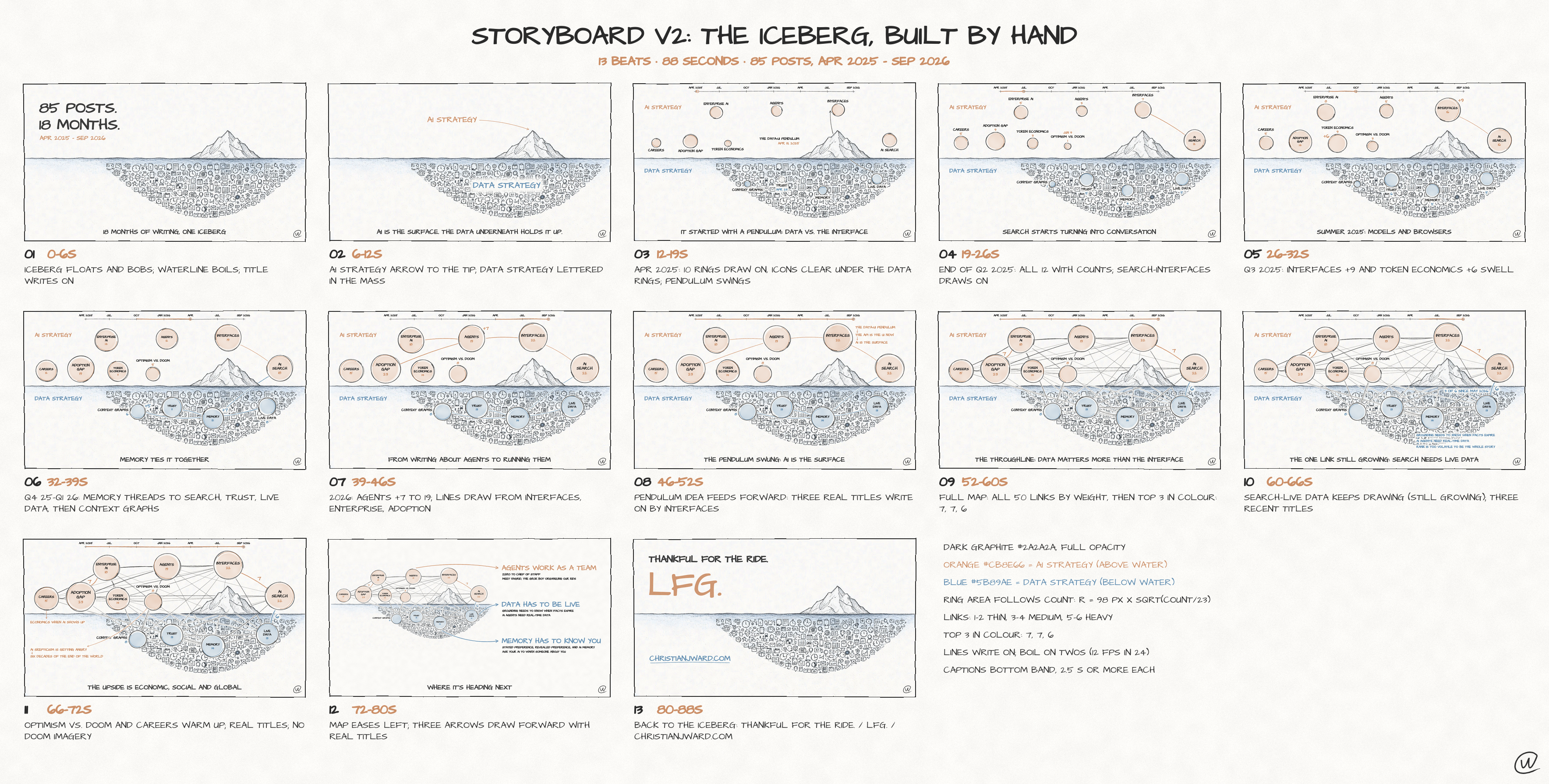
Then I changed the purpose of the whole thing. A map of my themes made sense to me because I'd written the posts. Someone arriving for the first time needed to know what I covered and what they'd get out of reading it.
So I asked for a primer. Explain the writing first, then move through the themes faster. That meant a new narration script and a different balance of what stayed on screen.
I also asked for a visible eraser, then asked for it to disappear. I wanted a calmer read, then found the result way too slow and downbeat. The model followed those instructions. I was working out my preferences by watching them happen.
The voice made this especially clear. The model could compare voices by measurement and use transcription to check that the words came through correctly. It couldn't listen to the result.
One of the voices it selected still wasn't one I liked. I asked for the earlier voice back at the faster pace.
There were technical fixes along the way too, including overlapping labels and a picture that looked blurry on my iPad. Those needed correcting. But the larger changes came from me deciding what the video should say and how it should feel.
As anyone who works with data will tell you, going from 90% accuracy to 99% is where the effort comes in. With this video, that last stretch meant getting closer to what I wanted, while I was still figuring that out myself.
I haven't tried the higher Opus effort settings yet. Maybe that would change what I get on the first attempt. I do know how much of this process came from my own changes of mind.
There's still an element of taste here, and I really don't want us to lose it. Being impressed with the first result leaves plenty of room to want a different voice, a faster pace or a better explanation of why someone should care enough to watch.
Below is the brief I could have given if I'd known what I wanted. It assumes the same source material, approved artwork, local tools and access to Google's Gemini voices. It includes decisions I made across those versions, so I can't promise it would produce the same video in one pass.
Make a hand-drawn animated explainer video about my 18 months of writing at christianjward.com. Work only in this folder and publish nothing.

SOURCES
themes.json and story.md are the only source of numbers and post titles. Never invent either. Get the live published post count read-only from Supabase blog_posts (status = confirmed) and use that number. Never write secrets to any file.

STORY (a primer, value first, then themes; a third-person narrator, never pretending to be me)
1. Open on the approved floating iceberg. About 18 months of writing on AI and the data underneath it, [live count] posts, all at christianjward.com.
2. AI STRATEGY in orange above the waterline. DATA STRATEGY in blue below, holding it up.
3. Two directions at once. Personal, the AI my family actually uses, like Hagrid, the Grok bot for my kids. Corporate, research and analysis from my role at Yext.
4. What you get. Plain-language, practical judgment about where AI and data are going, grounded in real use.
5. The themes, fast. Compress 18 months of growth into a couple of seconds, then show how connected they are. Adoption in every quarter. Trust from week two, its threads reaching across the map. Memory and context everywhere. "AI Memory Features Will Transform Search and Marketing" was one of the most shared posts, and within a month it showed up in three different talks at SEO Week in New York. 50 of 66 theme pairs share a post. AI is the surface, but the data underneath matters more.
6. Thank you for reading, a fascinating look back. Then the camera dives below the waterline and the pencil letters CHRISTIANJWARD.COM across the data ocean, with a tiny iceberg as the dot. Hold 2 to 3 seconds as the end card and poster. No LFG, no predictions teaser.

LOOK
Warm paper #FBFAF7. Dark, finished graphite lines (#2A2A2A, full opacity). Orange #CB8E66, blue #5B89AE, pale washes only. Nothing faint. Every letter in Architects Daughter, ALL CAPS. Ring area proportional to post count. Strokes write on with a gentle line boil and a slow camera drift, always alive but calm. Show the pencil only for the main lettering moments and move it slowly. No eraser, things fade. Dark CW stamp bottom right. Burned-in captions that track the voice, at least 1.8 seconds each, plus captions.srt.

VOICE AND MUSIC
Gemini TTS. A prebuilt American male voice that says every word properly, wry, quick, a little gravelly, confident and dry. Audition several (Algenib, Charon, Orus and others) and choose by measurement and Whisper read-back. Upbeat, about 3.3 words per second, breaths of 0.15 to 0.4 seconds. No cloning or imitating anyone.
An original, bouncy Vince Guaraldi-style jazz piano trio in the spirit of "Linus and Lucy" without its melody, riff or recording. Major key, about 175 bpm swing, walking bass, brushes. Keep it clearly audible under the voice, about 9 dB down, louder in the gaps and up front on the end card, resolving there. Keep the piano in the range phone and iPad speakers reproduce. Mix to -14 LUFS and -1 dBTP.

DELIVERY
About 85 to 90 seconds, 1920x1080, 30 fps. Draw every frame at 2x and downsample once so lines stay crisp on an iPad. x264 High, CRF 14, yuv420p, BT.709, faststart, AAC. Also a share copy under 25 MB that stays 1080p.
Write script.md and a storyboard sheet first, then render. Before you report, check Whisper read-back of every line, pace and gaps, text overlaps, every number against the data and loudness. Report paths, duration and your choices.
Get More Where This Came From
One letter a week, mostly. AI frameworks and data strategy for people who have to make the call.